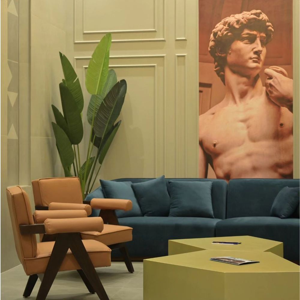
Olive green and antique gold is our signature pairing. Used well, it feels rich, calm and timeless.
Why the pairing works
Olive is a deep, natural green that sits comfortably with wood and stone. Antique gold is softer and warmer than bright brass, so it adds glow without glitter.
Let olive lead
Use olive on larger surfaces: walls, panelling, upholstery or a statement cabinet. It makes a room feel grounded.
Use gold as jewellery
Keep gold for details: lamp bases, handles, mirror frames, a thin inlay line. A little goes a long way.
Balance with cream and wood
Cream walls or fabrics keep the palette light. Warm timber connects the green and the gold.
Add one deeper accent
Teal, tan leather or terracotta sits beautifully beside olive. In one of our lounges, a teal sofa and tan armchairs stand against olive panelled walls.
Mind the light
Olive looks richest in warm light. Test paint and fabric samples in the room at different times of day before you decide.
Keep it timeless
- Matte or satin finishes rather than high gloss
- Real materials over imitations where the budget allows
- Fewer, better pieces
- Repeat the palette from room to room
Planning a project and want a second opinion?
Talk to AAS